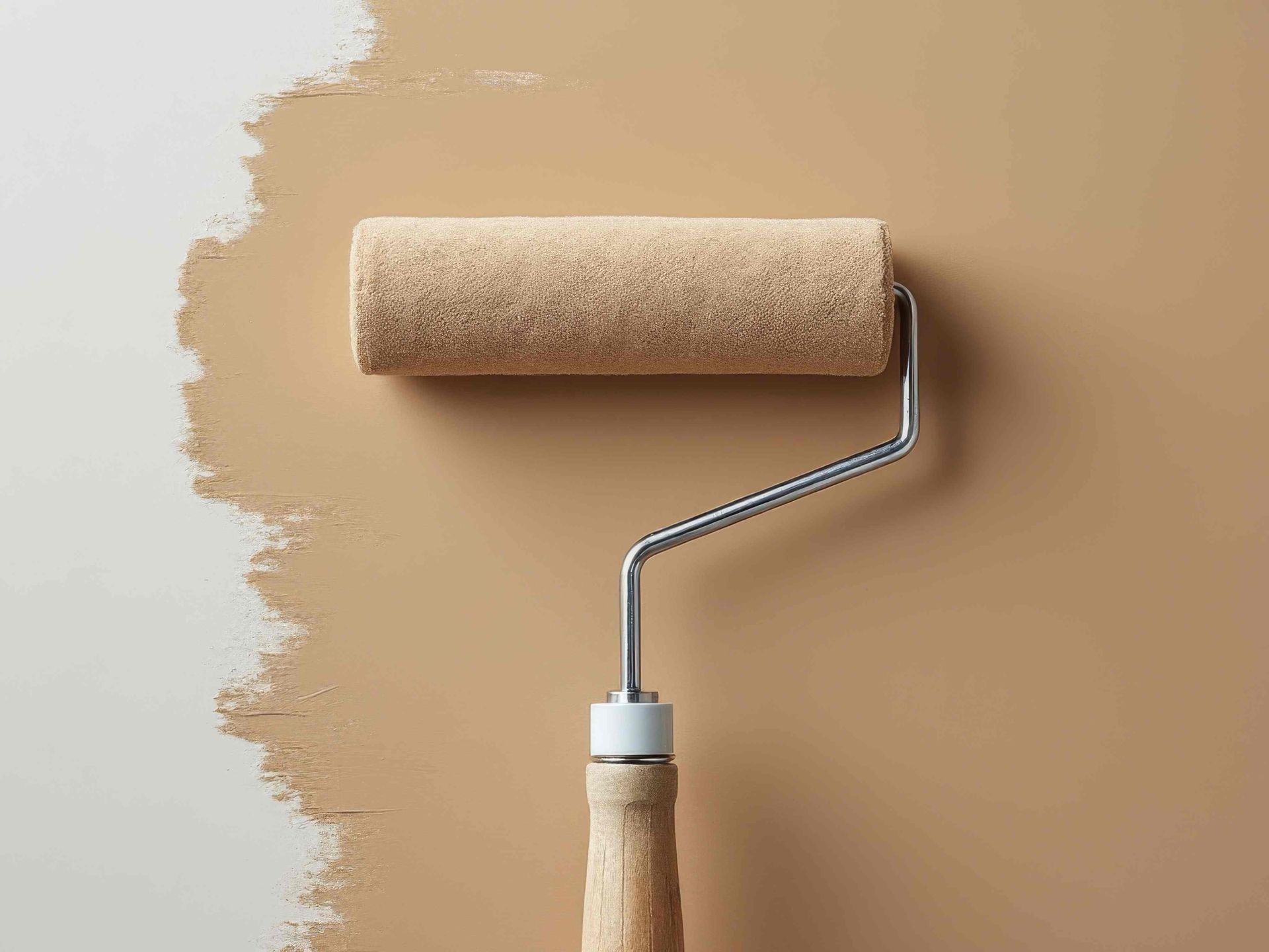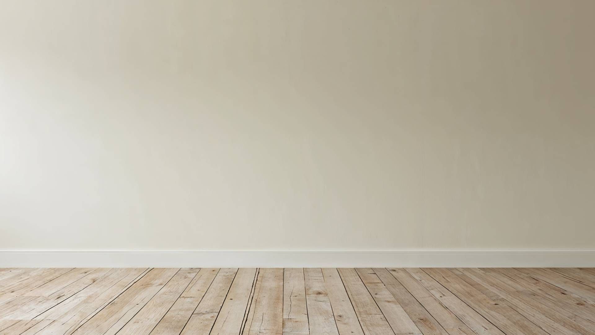
Neutral Paint Colors Know-How
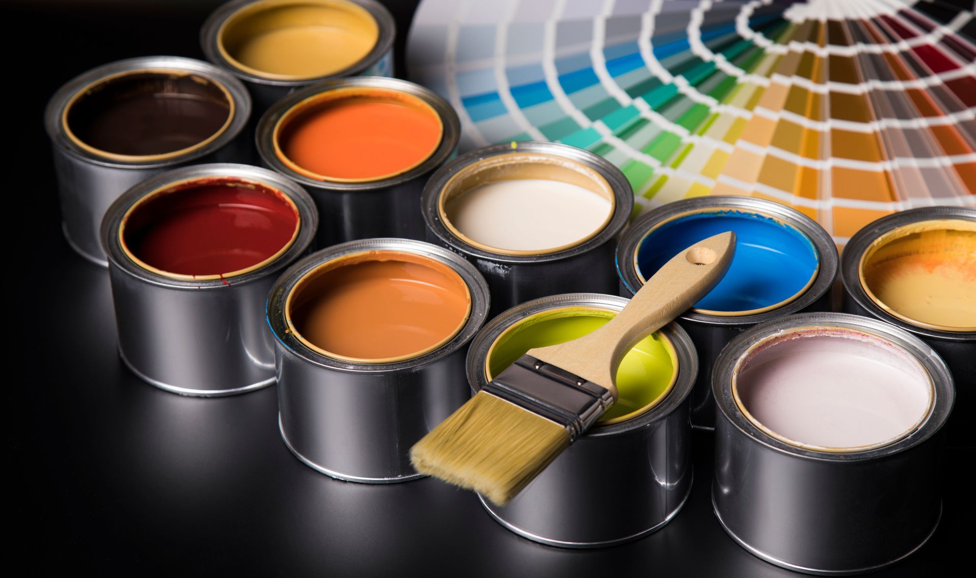
There’s a lot to be said for neutral colors. If you’re considering selling your home, a neutral color palette will be your second best friend behind your realtor; alternatively, a fresh coat of paint in a neutral hue can also renew your love for a home you plan to continue living in. The Benjamin Moore paint experts at 21st Century Paints have ample neutral paint color know-how and can help you create a neutral color palette full of subtle style.
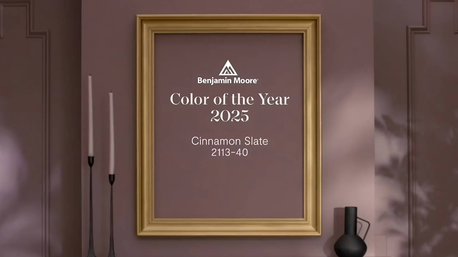
What Are Neutral Colors?
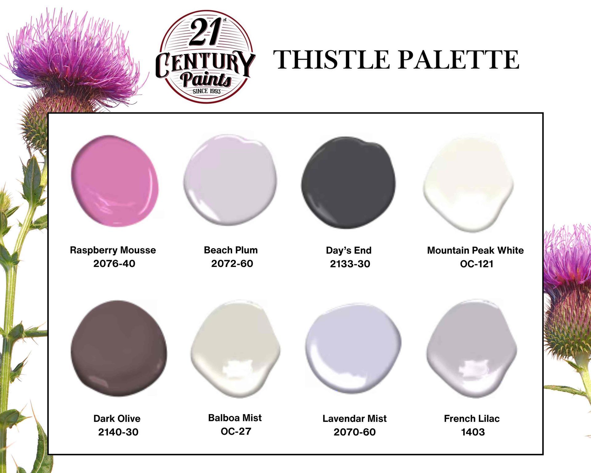
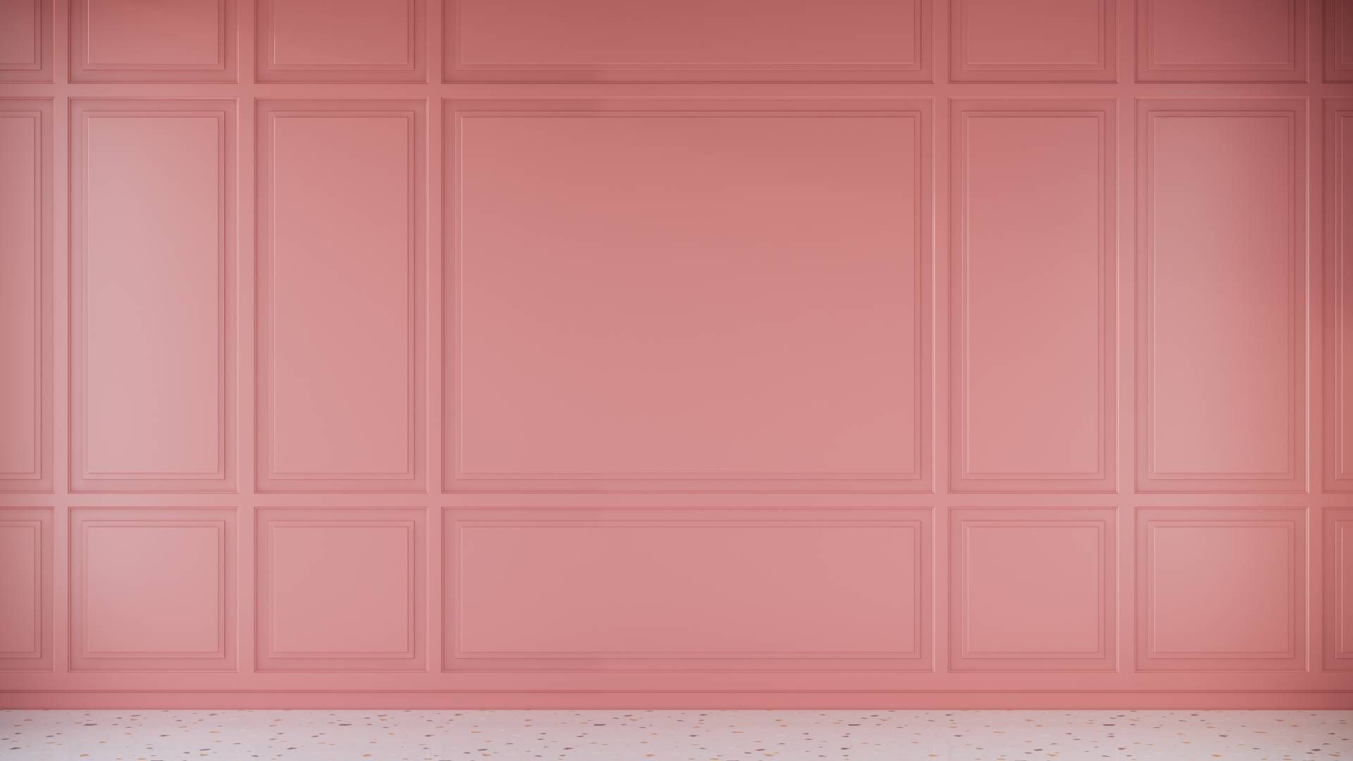
A neutral palette is made using unsaturated colors. Neutral colors often appear to lack color but have undertones that are brought to life with different lighting. Since they are not found on the color wheel, neutral tones complement primary and secondary colors rather than compete with them. The most common neutral shades include:
- Gray
- Brown
- White
Set a Relaxing Atmosphere
It’s undeniable that colors have the power to affect our mood. This is why you frequently see neutral shades in soothing spaces like bedrooms. Every neutral color is associated with environmental attributes:
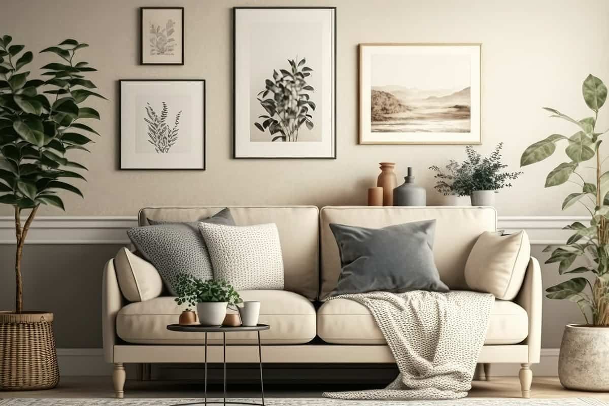
- White conveys a sense of peace and simplicity. Shades of off-white are seen as classic and elegant. All shades of white are seen as uplifting and optimistic.
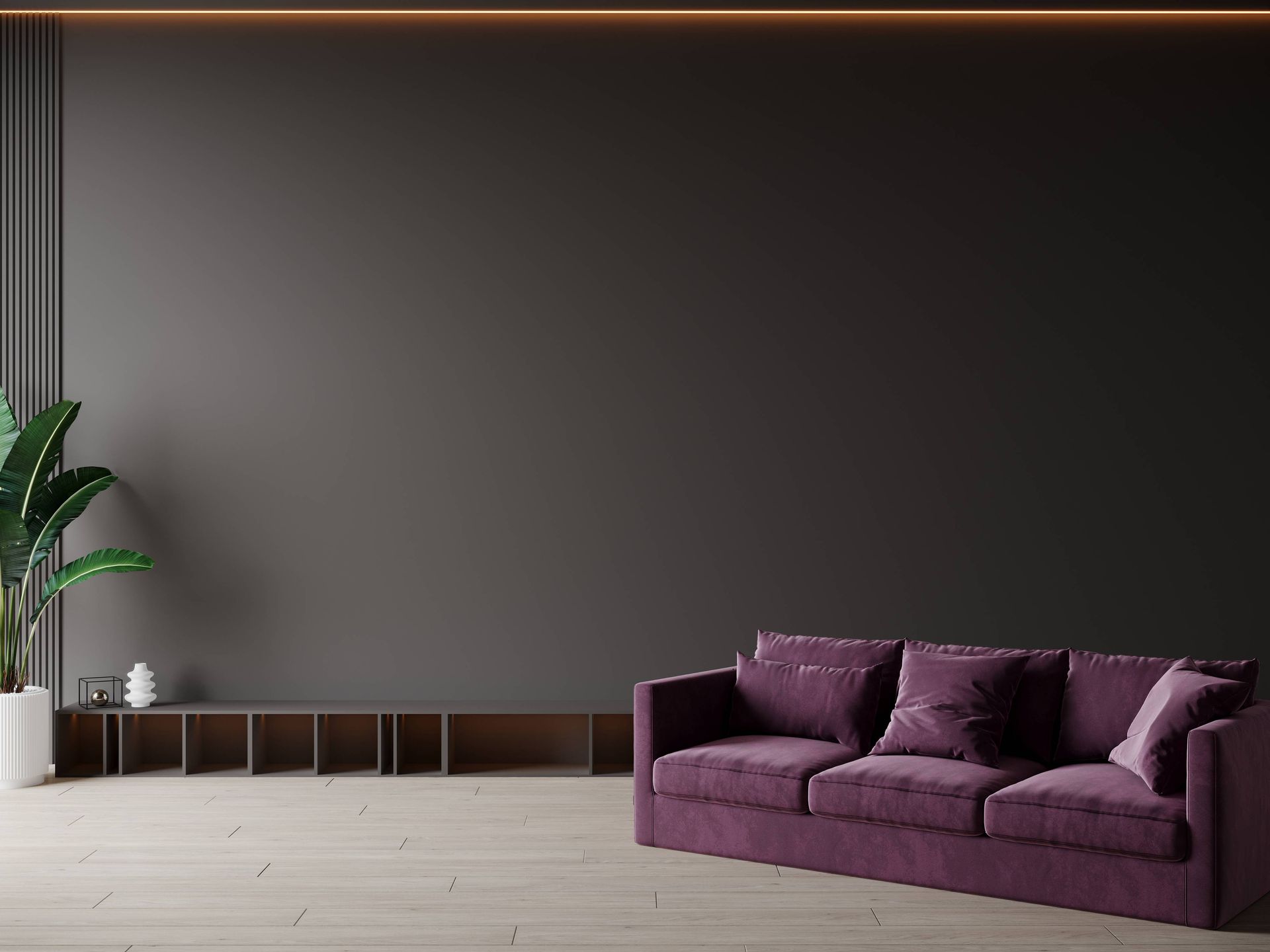
- The many shades of gray allow you to achieve a variety of different moods. Darker grays make a room feel dramatic and sophisticated, while lighter shades have a soothing effect. If gray is your neutral of choice, balance it with vibrant accents to avoid a gloomy aesthetic.
- Brown is one of the most dominant shades in nature, making it a color associated with authenticity and strength. The color also makes a room feel warm and welcoming, enhancing its traditional aesthetic.
Neutral Colors Have Universal Appeal
Neutral shades work with any style of decor and furniture. You can use neutral colors to create an enticing backdrop for a bold, eclectic style or a monochromic aesthetic with refreshing neutral pieces. A bold vase or sculpture will stand out beautifully against neutral hues. Our eyes are naturally attracted to bright colors, so pairing a neutral shade with a brighter hue makes that shade appear more vibrant.
Using neutrals and brighter colors in the same space lessens the chance of visual overwhelm that happens when too many vibrant hues are together. You can also create the illusion of more space with neutral tones. This is especially true in rooms that have little natural light. By keeping the eye moving, a room will look and feel more spacious.
Contact Us
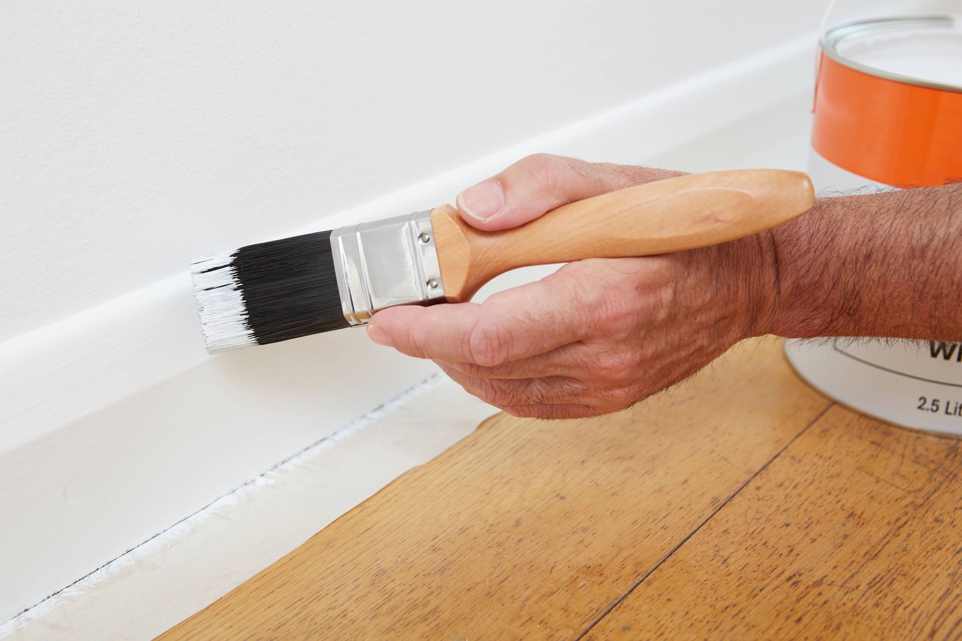
21st Century Paints is your one-stop shop for residential, industrial, and commercial paint needs. We also carry a wide selection of specialty products for more involved DIY projects. Give us a call at (419) 841-2100 to chat about your paint needs, or send us a message. We’re in Holland, OH, and pleased to serve Holland, Toledo, Bowling Green, Findlay, Sandusky, OH & Monroe, MI.