October 21, 2026
Modern home design continues to evolve as homeowners seek fresh ways to personalize their living spaces. Choosing the right interior color plays a central role in setting the tone for every room, whether you desire a calming sanctuary or a bold, dramatic statement. Visiting a local paint store allows you to transform standard rooms into stunning modern retreats using high-quality Pittsburgh Paints. According to survey data from Workyard, 93% of American homeowners have painted at least one room in their home. This widespread commitment to home improvement highlights how essential color selection is to overall aesthetic appeal. By exploring the latest modern color trends at your neighborhood paint store, you can refresh your living room, bedroom, or kitchen with confident style. Understanding how current tones interact with natural light and existing decor ensures a polished finish. Embracing rich colors gives your home a contemporary upgrade while maintaining a cozy, welcoming atmosphere.
Embracing Rich, Warm Tones
Deep, grounded shades are making a powerful comeback in modern interior design projects. Today's contemporary homes are moving away from stark white walls and moving toward cozy, inviting colors that you can easily preview at a local paint store. Applying rich mahogany, warm terracotta, or earthy rust hues creates an immediate sense of intimacy in dining areas, libraries, and study rooms. Warm mahogany serves as a flagship hue among deep earth tones, acting as a grounded alternative to traditional dark grays or blacks while providing a timeless anchor in spaces designed for conversation. Terracotta and rust bring sun-baked clay qualities into a room, offering reddish-orange undertones that create tactile visual warmth. These sophisticated selections work exceptionally well on accent walls or throughout full entertaining spaces. Pairing these deeper shades with warm wood furniture and brass accents creates a rich balance that elevates the entire room. When using bold colors, generous natural light keeps the space feeling expansive rather than enclosed.
Utilizing Calming Atmospheric Pastels
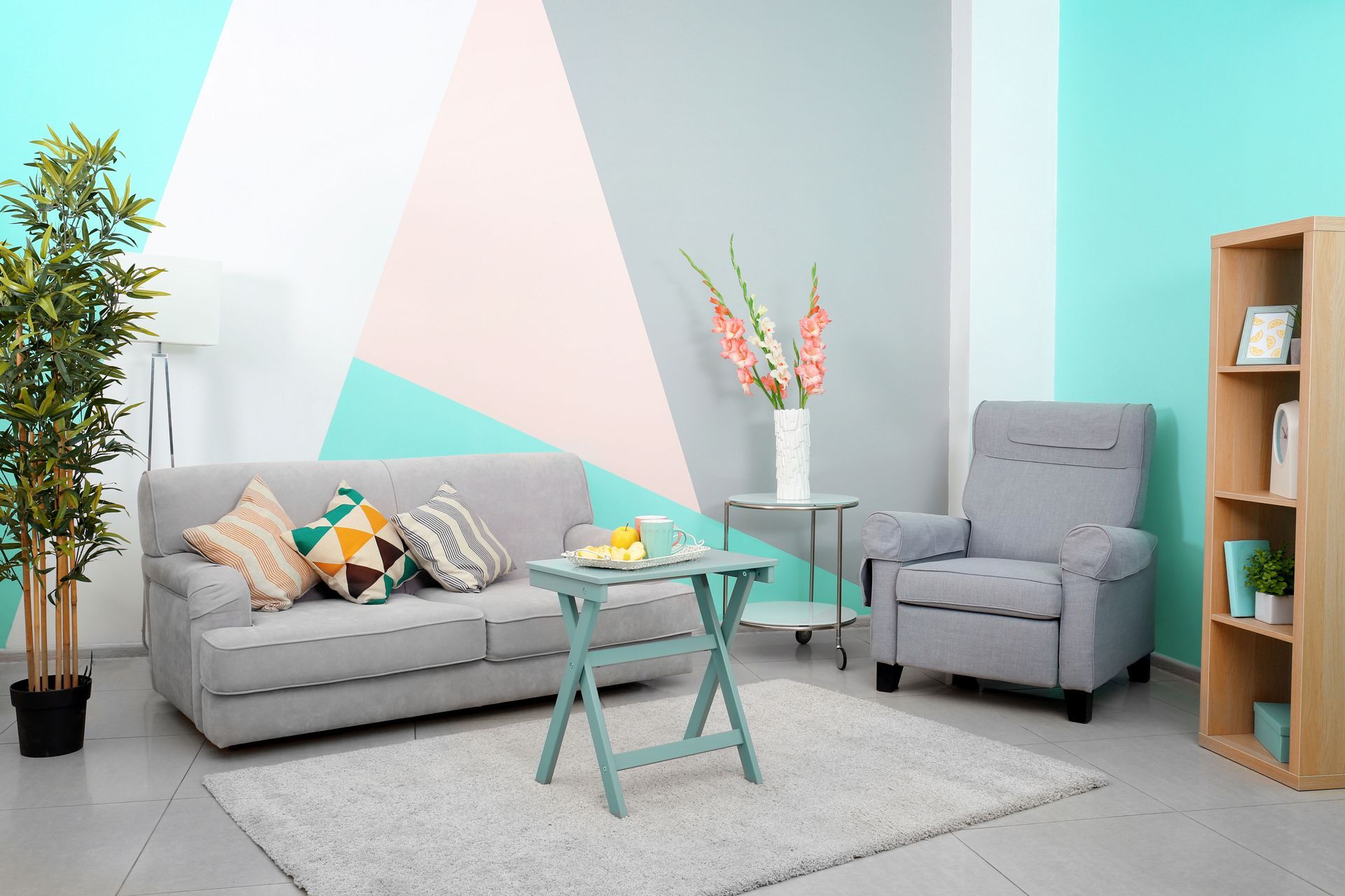
If you prefer a lighter and airier environment, soft atmospheric shades offer a serene aesthetic. Soft blues, muted greens, and gentle lavender tones allow modern rooms to feel open and restful. Selecting lighter hues with guidance from an expert at a paint store helps maximize natural light in smaller bedrooms, home offices, and bathrooms. Atmospheric soft sky and coastal blues reflect light gracefully, visually expanding tight quarters while introducing a sense of quiet calm. Muted sage greens bring a subtle outdoor quality inside, blending effortlessly with raw wood elements and indoor flora. Gentle lavenders offer a sophisticated alternative to traditional neutral creams, adding understated color without overwhelming minimalist design. These colors introduce subtle visual interest without overpowering existing furnishings or minimalist decor layouts. Layering these cool pastels with neutral linens and natural stone textures creates a tranquil environment suitable for everyday relaxation. Choosing pale blues or greens provides a versatile foundation that easily transitions across changing seasonal decor styles.
Creating Depth With Timeless Neutrals
While bold shades and soft pastels take center stage in design discussions, modern neutrals form the essential bridge connecting different areas of the house. Contemporary neutrals have evolved past basic, flat beige, relying instead on complex, multi-tonal shades that adapt fluidly to changing daylight. A visit to a dedicated paint store will show you that warm greige blends grey and beige to offer structure without coldness, making it an ideal candidate for open-concept living rooms, entryways, and connecting hallways. Creamy warm whites carry soft undertones of gold or cream that catch sunlight, making them perfect for kitchens, breakfast nooks, and architectural trim work. Earthy taupes provide deeper grey-brown tones that deliver subtle contrast against white trim in bedrooms, cozy sitting corners, and formal dining spaces. Using these complex neutrals on architectural details such as wainscoting, crown molding, and door frames allows you to introduce shadow and dimension without changing paint families across the home.
Mastering Paint Sheens and Lighting Mechanics
Selecting a paint color is only half the design process, as choosing the correct finish and accounting for light direction determines how the color performs throughout the day. Light sources alter paint perception dramatically, meaning a sample card picked up at a paint store can look completely different once applied to your home's walls. North-facing light tends to produce a cool, slightly bluish cast, which means rich warm tones like mahogany, terracotta, and warm taupe thrive here by neutralizing cold shadows. South-facing light delivers intense, warm light all day long, where cool pastels, muted greens, and soft blues counter the bright sunlight to keep the room feeling fresh. East-facing light is warm and yellow in the early morning before turning cooler by late afternoon, making balanced neutrals and mid-tone pastels the most adaptable choices. West-facing light remains cool in the morning followed by a hot, reddish glow in the late afternoon, where deep earth tones look particularly dramatic under evening western sunlight. In addition to lighting direction, paint sheath and finish control both durability and visual depth. Flat and matte finishes soak up light and hide wall imperfections, making them ideal for low-traffic ceilings and peaceful master bedrooms where a smooth appearance is desired. Eggshell and satin finishes provide a gentle sheen that wipes clean easily, working best in high-traffic living areas, hallways, and children's rooms. Semi-gloss and high-gloss options reflect light heavily and resist moisture, making them the standard choice for kitchen cabinets, bathroom surfaces, baseboards, and interior trim.
Applying Color Drenching Techniques
A major trend in modern interior aesthetics is color drenching, which is the practice of painting walls, baseboards, door frames, and even ceilings in the exact same shade or varying sheens of one color. Traditionally, trim was painted stark white to frame a wall, but color drenching removes these harsh lines, visually pushing back boundaries and making rooms feel larger and more cohesive. Consulting with a professional at a paint store can help you choose the right formula combinations for this technique. When drenching a space in a single shade, varying the finish creates a subtle shift in texture. Applying a matte coat on the ceiling, an eggshell finish on the walls, and a durable semi-gloss on the woodwork creates sophisticated visual texture while maintaining a clean, modern envelope.
Executing a Professional Paint Transformation
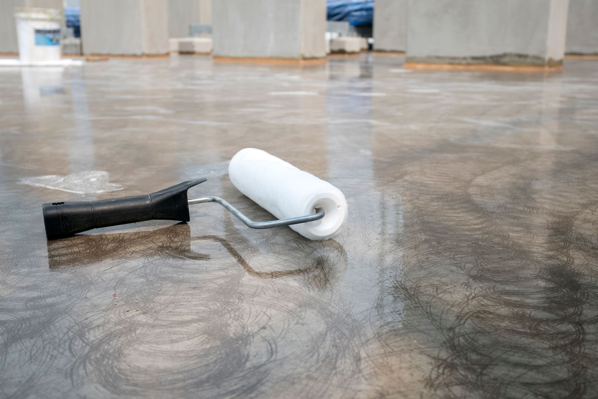
Achieving flawless results requires proper surface preparation and high-performance product choices, as skimping on prep work often leads to uneven adhesion, visible lap marks, and premature wear. Preparing the surface involves thoroughly cleaning walls to remove dust and grease, filling nail holes with spackle, sanding surfaces smooth, and wiping down all areas before opening a paint can. Priming is equally critical, as applying a quality primer from your local
paint store is necessary when transitioning from dark to light shades, over raw drywall, or when painting over repaired areas. Finally, using premium brushes for precise edge cutting alongside high-density roller covers ensures even coverage without excessive splatter or uneven texture. Refreshing your interior color scheme is one of the most effective ways to modernize your home's appearance and reflect your personal aesthetic. Whether you prefer deep mahogany tones, peaceful pastels, energetic accent shades, or timeless earthy neutrals, selecting premium coatings makes all the difference in achieving professional results. Partnering with experienced professionals ensures your project is completed with precision and care. Contact 21st Century Paints Inc today to explore color options, order physical swatches, and select the perfect finishes for your next home transformation.